Close menu
People and businesses have had to adapt more quickly than ever before, and as always in periods of dramatic change – design, technology and trends have to reflect the needs of the customer and fight their corner. New design and techniques are pushing onward and upwards and we need to keep ahead of the competition.
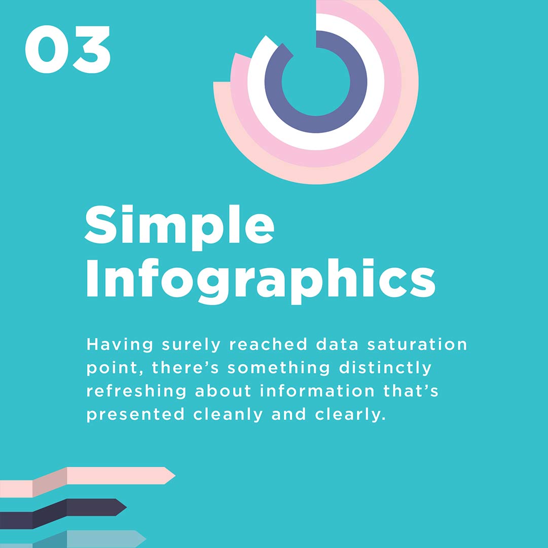
In design we are going to really rely on old favorites like muted colour palettes, serif fonts, and simple data info-graphics for clear communication, things that invoke a sense of calm, understanding, and positivity.
2020 brought a lot of negativity into the world — brands have the power to bring hope back to their customers.
By adopting design principles that spread positivity, soothe the customer, and are aesthetically pleasing.
We hope it will give you some idea of how to navigate the year ahead, and help keep you looking forward, in optimism and style.
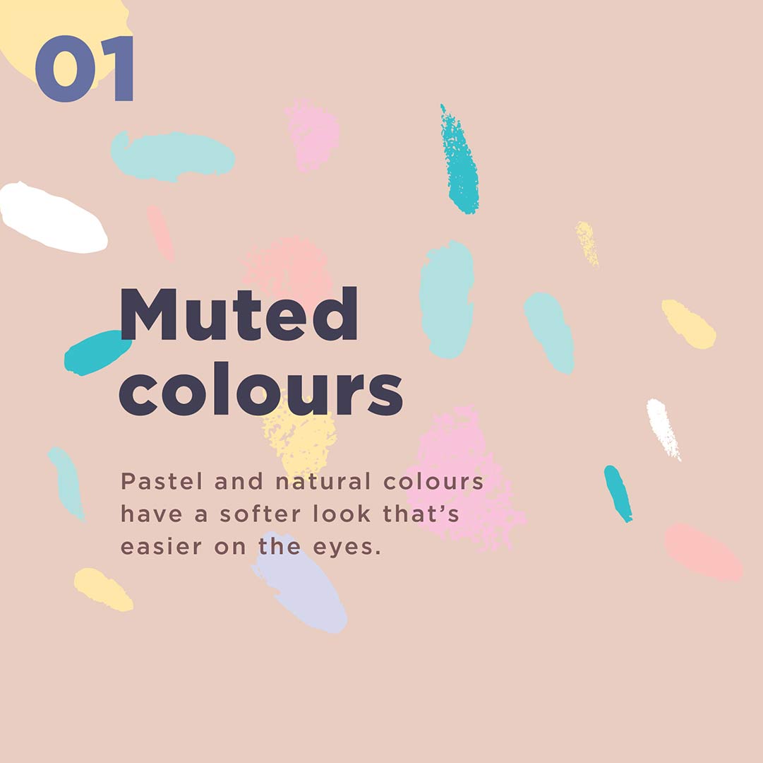
The colour trends you’ll see will largely feel calming and soothing. We’re not going to see a surge of neons or crazy contrasts. Instead, the upcoming colour trends are softer.
We’ll see lots of single-colour designs, muted colours, colours found in nature and palettes that easily blend together.
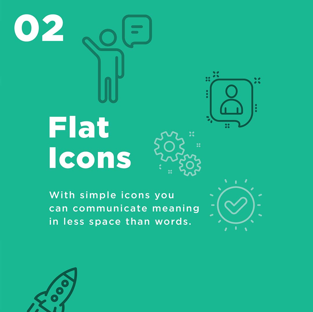
And this is exactly what we’re seeing with regards to icons and illustrations.
Icon styles are moving to a more stripped down and simplified look, again simpler to understand and simpler on the eyes.
So its all about being clear and clean in your design, making it simple and easy to undertsand, not too much information just enough to get your point across.
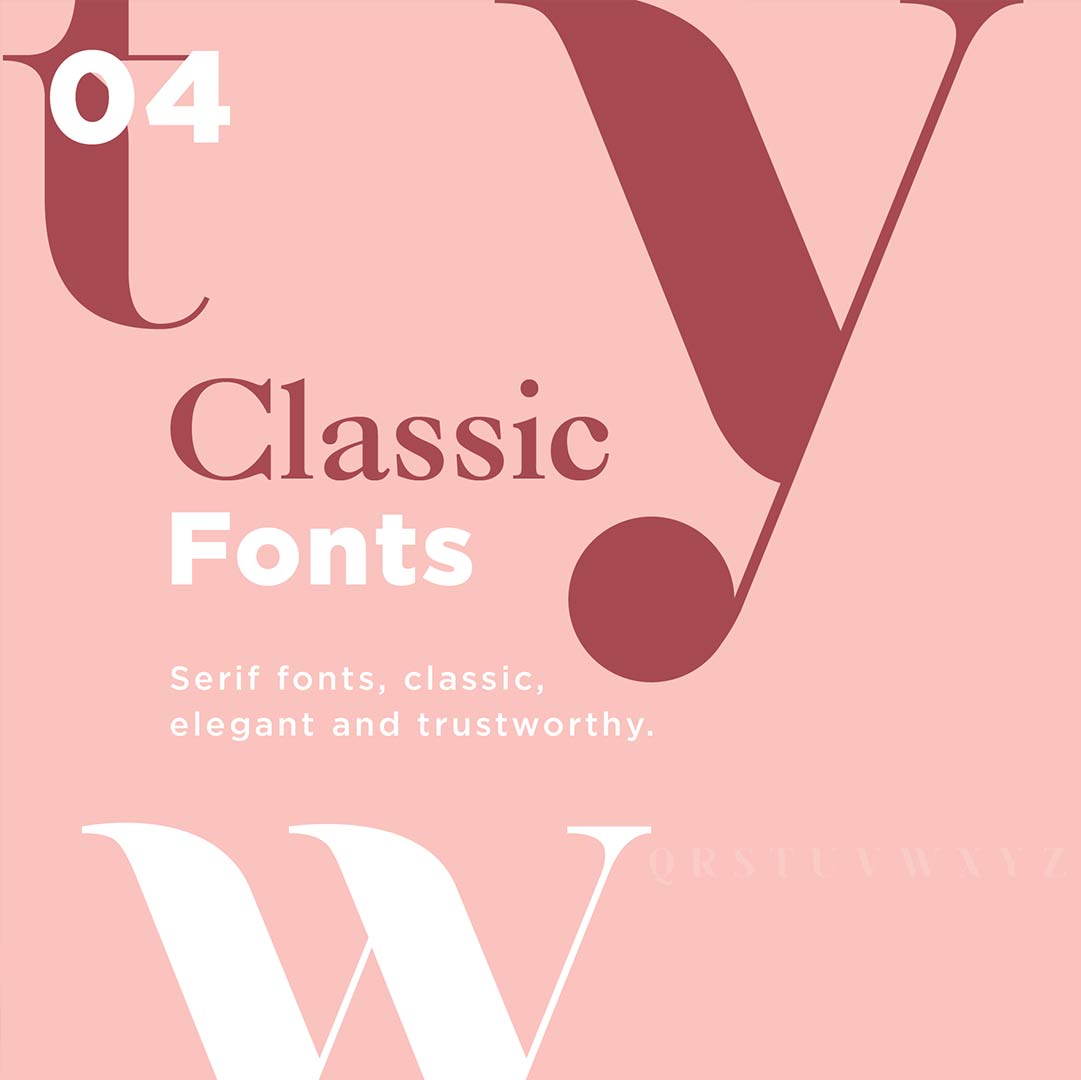
The serif font has been making a bit of a come back though last year. These fonts evoke nostalgia, elegance, and trustworthiness
Classic fonts are not as easy on the eyes as a san serif font. By mixing up both fonts and using a serif font as header and subheadings is a great way to go.
You might want to update your branding to include serif fonts for the near future, its so important to keep your brand moving forward and inhale these new styles.
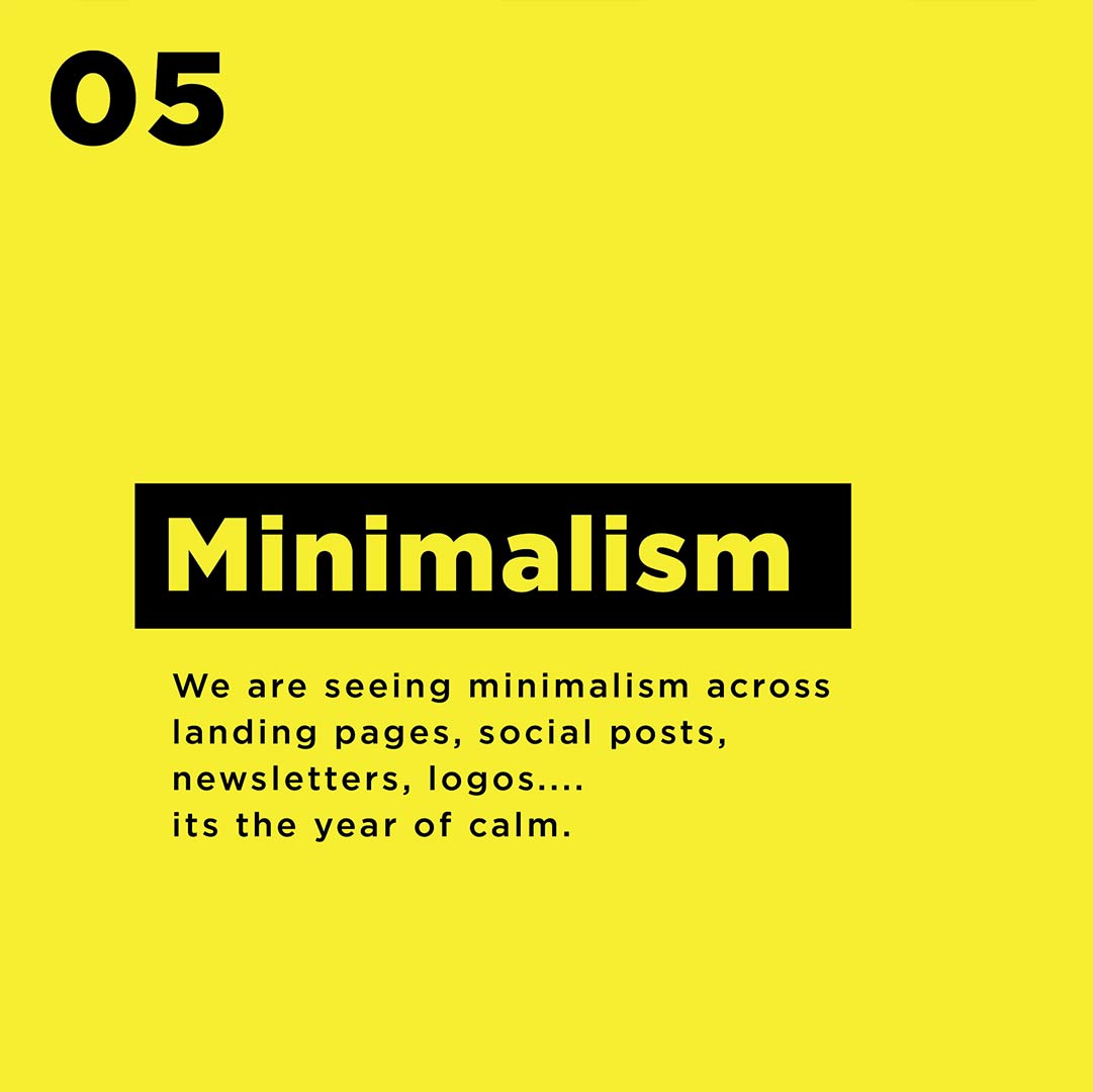
There has been a steady shift towards more minimalistic aesthetics every year, and that is going to continue.
We are seeing minimalism across landing pages, social posts, newsletters, logos, its the year of calm.