Close menu
Shlizzy have been growing fruit on their farm for over 30 years. Shlizzy combines quality spirits with homegrown fruit to produce fabulous fruit liqueurs.
The range is extensive, with popular flavors such as rhubarb and blackcurrant liqueur and more unusual flavours such as tayberry or gooseberry liqueur, there’s something for everyone!
Shlizzy is all about the occasion. Shlizzy means good times, fun, a celebration, or a night to remember. Also Shlizzy is all about quality produce lovingly tended to and grown in North Wales.
When we were developing the brand we had to think about all of these things and encapsulate them. The brief was to make a fun brand mark that represents the origin and ethos of Shlizzy.
![]()
Using bold colours and energetic & fizzy lines to create bespoke typography, we developed a brand mark that is fun and vibrant, throughout the design we have also utilised bespoke fruit drawings that are represented in a classy lithographic style, they compliment the brand mark perfectly and echo the heritage of Shlizzy.
When we had finalised the design we produced a comprehensive brand pack that contained all of the necessary files for print, web and stationary. After this had been accolmplshed the next phase of the project was to design bespoke labels and packaging.
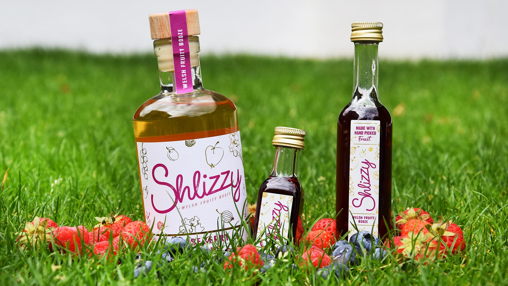
For launch, Shlizzy needed custom packaging and labels designed for all of their products, from miniatures to full sized bottles we created informative designs that utilise clean typography that marries with the fun and classy brand mark. The end result is clear, classy and vibrant. Shlizzy stands apart from the norm in a positive and colourful way.
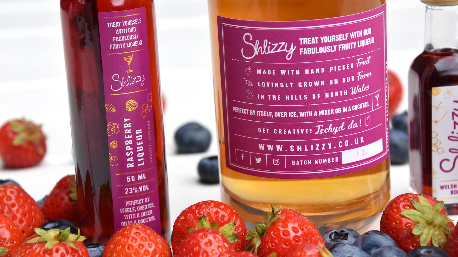
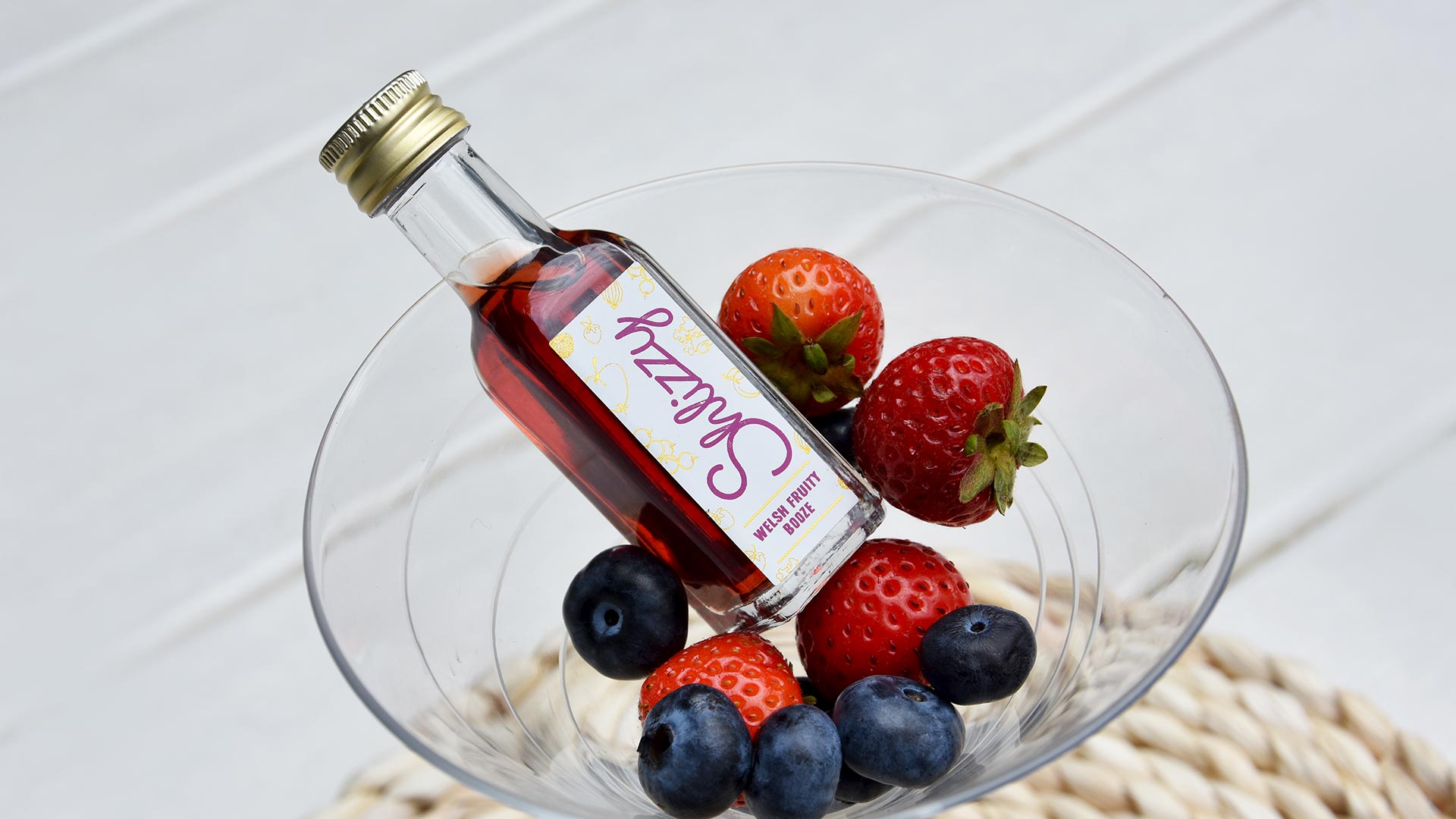
There were a number of processes utilised on the final label designs. We went for vibrant colours with the finer details such as fruit and lettering being picked out in gold, giving a classy fun feel to the products. All of the final file setup was taken care of by the team at Zeal. As you can see from the product photography the results speak for themselves.
This was a great project to work on. If you need to revamp or re-imagine your brand, get in touch here.

We design a lot of food and drink branding and packaging for independent food producers, take a look.