Close menu
AOP’s mission is to support media owners in their continued commitment to the creation and distribution of high-quality original content, for the benefit of the consumer.
Formed in 2002, Association of Online Publishers (AOP) is a UK industry body representing digital publishing companies.
.
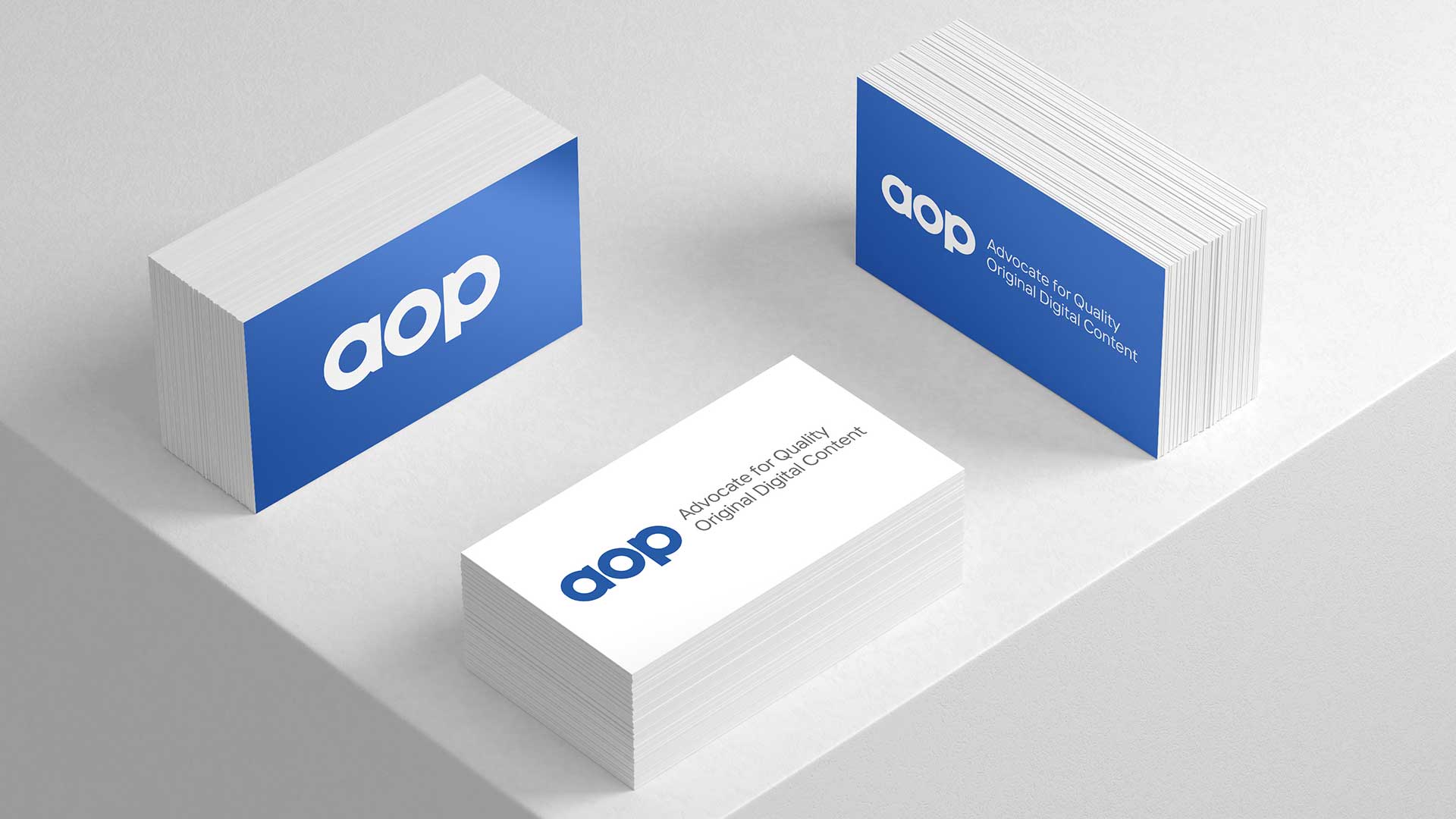
AOP is a well recognised brand in the media industry. They represent some of the biggest media outlets in the world, so it was important that we evolved / modernised the brand mark rather than completely rework it.
When we began work with AOP it was clear that AOP were open to Zeal’s ideas and suggestions (as a design team this is great!), we noticed that whilst redesigning their website (post coming soon!) that some of the core brand marks the business use needed a bit of attention.
![]()
These brandmarks go back to 2002, so obviously during the period of 20 years they have been viewed and thus recognised many times. Our aim was to keep the look and feel similar, but, to modernise and clean up the shapes used in the designs.
Having said this, we made small changes to the fonts / shapes of the logo suite to increase their solidity and structure, also, via altering the weight / symmetry of the brand marks we increased legibility and modernity.
The brand marks now sit beutifully amongst the clients they represent and will serve AOP well going into the future.