Retro Styler have a strong online presence and customer base. Fans and clients expect colourful, punchy and quality merchandise, to show their support for their favourite movies, characters and shows.
Not only does it have to shout RETRO, it has to be synonymous with their marketplace, as well as, being flexible enough to fit in with a plethora of design languages, from Marvel to Lord of the Rings to Star Wars, it has to work everywhere! But also, it has to be funky, fun and vibrant – sounds like our sort of gig! We love creating fresh brand marks to push businesses that extra inch.
.
How we helped
Retro Styler are a fun, bright and vibrant business with a passion for all things ‘retro’. Right from the off we clicked with the team at Retro Styler (Zeal also loves Retro merchandise!) we instantly had a great dynamic and understanding of what needed to be achieved.


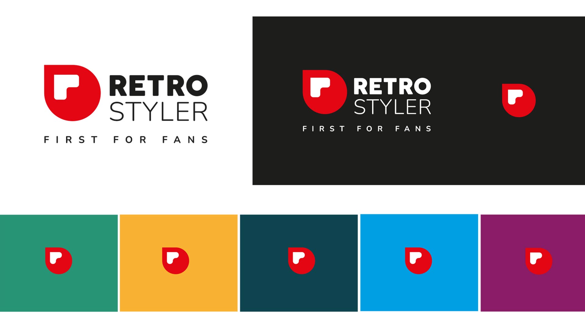
The new Retro Styler brand mark needed to be funky, fresh and visible, by visible we mean it has to stand out amongst competitors in the conference centre (y’know comic-con and the like!?). It also had to be adaptable to custom merch, so the design needed a degree of simplicity… So… funky, fresh, bright, recognisable, retro AND simple – got it!
We played with lots Warhol-esque colours and simple recognisable shapes, we wanted to create a brand-mark that was friendly, and, something that the team at Retro could get behind and really sell! after a bit of iteration we found the shape. See the images to take a look at where we landed, it works in every one of the ways listed above and gives Retro Styler that unique but professional look they were after!
Whilst we were developing the brand-mark we also created a new strap-line for the business, something that encapsulates what the business does and is… ‘First for Fans’ – pretty good eh? 🙂

We work with many clients, take a look.


